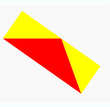
Let’s break it into pieces:
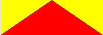
The yellow borders are actually set as transparent in the final product so they don’t show. They are yellow here to show how the borders look.
As commented above, this answer shows the idea behind the basic triangle shape.
The div by itself:
<div id="star-five"></div>

Combining the :before pseudo element is the same as this:
<div id="star-five">
    <div id="before"></div>
</div>

Finally, combining the :after pseudo element is the same as this:
<div id="star-five">
    <div id="before"></div>

    <div id="after"></div>
</div>
Now you overlap each element precisely using position: absolute; and rotate with transform as needed to get the final product:
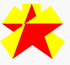
Let’s visualise it!