Native ( but limited )
SwiftUI is not currently supporting native SegmentedPicker styling (see the bottom of the answer for the working workaround). But there is a limited way to apply a color to the segmented picker using .colorMultiply() modifier:
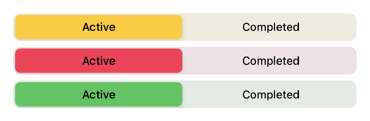
Full control using UIAppearance
selectedSegmentTintColor is available since beta 3 for changing the color of the selected segment.
For changing the textColor, you should use setTitleTextAttributes for .selected state and .normal state (unselected).
So it will be like:
init() {
    UISegmentedControl.appearance().selectedSegmentTintColor = .blue
    UISegmentedControl.appearance().setTitleTextAttributes([.foregroundColor: UIColor.white], for: .selected)
    UISegmentedControl.appearance().setTitleTextAttributes([.foregroundColor: UIColor.blue], for: .normal)
}

Also as mike mentioned, you can set the background color too like:
UISegmentedControl.appearance().backgroundColor = .yellow

Also, don’t forget you can set SwiftUI colors too! For example:
UISegmentedControl.appearance().selectedSegmentTintColor = UIColor(Color.accentColor)