Block Formatting Contexts
Floats, absolutely positioned
elements, block containers (such as
inline-blocks, table-cells, and
table-captions) that are not block
boxes, and block boxes with ‘overflow’
other than ‘visible’ (except when that
value has been propagated to the
viewport) establish new block formatting contexts for their contents.
With my bold, it’s the establish bit that is important
What this means is that the element you use overflow (anything other than visible) or float or inline-block..etc on becomes responsible for the layout of its child elements. It’s the child elements which are then “contained”, whether that’s floats or collapsing margins they should be wholly contained by their bounding parent.
In a block formatting context, each
box’s left outer edge touches the left
edge of the containing block (for
right-to-left formatting, right edges
touch)
What the above line means:
Because a box can only be rectangular and not irregular shaped this means a new block formatting context between two floats (or even beside one) will not wrap around neighbouring side floats. The inner, child boxes can only extend as far as to touch their parents left (or right in RTL) edge. It’s this behaviour that’s useful for columnar style layouts. The main use of it however is to stop floats, say in a “main content” div, actually clearing floated side columns, i.e. floats that appear earlier in the source code.
Float Clearance
In normal circumstances floats are supposed to clear all previous floated elements, that’s previously floated in the whole source code, not just your displayed “column”
The telling quote from the “float clearance specs” is:
This property indicates which sides of
an element’s box(es) may not be
adjacent to an earlier floating box.
The ‘clear’ property does not consider
floats inside the element itself or in other block formatting contexts
So say you have a three column layout where the left and right columns are floated left and right respectively, the side columns are now in new Block Formatting Contexts, because they are floated (remember float is also one of the properties that establish a new BFC), so you can happily float list elements inside them and they only clear floats which are already inside the side columns they no longer care about floats previously in the source code
##To make the main content a new Block Formatting Context or not?
Now that middle column, you can simply margin it from both sides so that it appears to sit neatly between the two side floated columns and take the remaining width, a common way to get desired width if the centre column is “fluid” – which will be fine until you need to use floats/clearance inside your content div (a common occurrence for those using “clearfix” hacks or templates including them)
Take this very simple code:
#left-col {
  border: 1px solid #000;
  width: 180px;
  float: left;
}
#right-col {
  border: 1px solid #000;
  width: 180px;
  float: right;
  height: 200px;
}
#content {
  background: #eee;
  margin: 0 200px;
}
.floated {
  float: right;
  width: 180px;
  height: 100px;
  background: #dad;
}
<div id="left-col">left column</div>
<div id="right-col">right column</div>
<div id="content">
<h3>Main Content</h3>
<p>Lorem ipsum etc..</p>
<div class="floated">this a floated box</div>
<div class="floated">this a floated box</div>
</div>It produces the following:
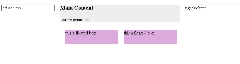
In general this is fine, especially if you have no background colours or internal (in the main content) floats – notice the floats are fine (not cleared yet) they’re doing probably what you except them to but they, the H3‘s top margin and the p‘s bottom margin are not actually really contained by the content div (lightgrey background).
So to the same simple margined scenario of above code add:
.clear-r {clear: right;}
to the CSS, and change the second HTML floated box to:
<div class="floated clear-r"> this a floated cleared box</div>
#left-col {
  border: 1px solid #000;
  width: 180px;
  float: left;
}
#right-col {
  border: 1px solid #000;
  width: 180px;
  float: right;
  height: 200px;
}
#content {
  background: #eee;
  margin: 0 200px;
}
.floated {
  float: right;
  width: 180px;
  height: 100px;
  background: #dad;
}
.clear-r {
  clear: right;
}
<div id="left-col">left column</div>
<div id="right-col">right column</div>
<div id="content">
<h3>Main Content</h3>
<p>Lorem ipsum etc..</p>
<div class="floated">this a floated box</div>
<div class="floated clear-r">this a floated cleared box</div>
</div>This time you get this:
The second float is clearing the right side but it’s clearing the whole height of the right column. The right column is floated earlier in the source code so it’s clearing it as told! Probably not the desired effect though, also note the h3 and p margins are still collapsed (not contained).
###Make it establish a Block Formatting Context, for the sake of the children!
and finally make the main content column take responsibility – become a Block Formatting Context – for its contents : remove margin: 0 200px; from the main content CSS and ADD overflow: hidden; and you get this:
#left-col {
  border: 1px solid #000;
  width: 180px;
  float: left;
}
#right-col {
  border: 1px solid #000;
  width: 180px;
  float: right;
  height: 200px;
}
#content {
  background: #eee;
  overflow: hidden;
}
.floated {
  float: right;
  width: 180px;
  height: 100px;
  background: #dad;
}
.clear-r {
  clear: right;
}
<div id="left-col">left column</div>
<div id="right-col">right column</div>
<div id="content">
<h3>Main Content</h3>
<p>Lorem ipsum etc..</p>
<div class="floated">this a floated box</div>
<div class="floated clear-r">this a floated cleared box</div>
</div>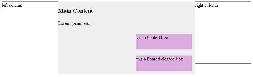
This is probably much more like what you would expect to happen, note now the floats are contained, they clear properly ignoring the right side column, and also the h3 and p margins are contained instead of collapsed.
With the extensive use of resets these days the margins are less noticeable (and IE still doesn’t get them quite right) however what just happened to the centre “main content” is that it became a Block Formatting Context and is now responsible for its own child (descendant) elements. It’s actually very similar to Microsoft’s early days notion of hasLayout, it uses the same properties display: inline-block, float, and overflow anything other than visible, and of course table cells always have layout.. it is however without the bugs 😉
##Update: re more information in question:
When you say “but floating elements are ignored when user agent draws box and take them into account when they fill out content.”
Yes floats normally overlay their container boxes, is that what you mean about parent boundaries? When a block element is drawn and it contains a float the block parent itself is drawn as a rectangle under the float and it is the “inline anonymous boxes” or simply “line boxes” of the other child elements that are shortened to make room for the float
Take this code:
#content {
  background: #eee;
  color #000;
  border: 3px solid #444;
}
.float {
  background: rgba(0, 0, 255, 0.5);
  border: 1px solid #00f;
  width: 150px;
  height: 150px;
  float: left;
  margin: 10px;
}
p {
  background: #444;
  color: #fff;
}
<div id="content">
<div class="float">floated box</div>
<h3>This is a content box</h3>
<p>it contains a left floated box, you can see the actual content div does go under the float, but that it is the <h3> and <p> <b>line boxes</b> that are shortened to make room for the float, this is normal behaviour</p>
</div>Which produces this:
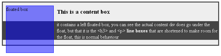
You see that the parent element doesn’t actually contain the float, as in it doesn’t wrap it entirely.. the float is simply floating on top of the content – if you were to keep adding content to the div it would eventually wrap underneath the float because there would be no need for the (anonymous) “line boxes” of the p element to shorten themselves any more.
I’ve coloured the paragraph element so you can see that it too actually goes under the float, the darkgray background is where the paragraph starts, the white text is where the “anonymous line box” starts – it’s only actually them that “make room” for the float, unless you tell it otherwise (i.e. you change the context)
Again referring to the above picture, if you were to margin the left side of thep element, yes it will stop the text wrapping under the bottom of the float because the “line boxes” (the white text) will only touch the left edge of their container, and you will bring the coloured background of the p to the right, clear of the float, but you won’t have changed the behaviour of the p‘s formatting context. Like the centre column in the first picture way above 😉