It requires the official MaterialCardView (which extends the androidx.cardview.widget.CardView) and at least the version 1.1.0 of the Material components library.
Add to your layout the MaterialCardView:
    <com.google.android.material.card.MaterialCardView
        style="@style/CustomCardViewStyle"
        ...>

    </com.google.android.material.card.MaterialCardView>
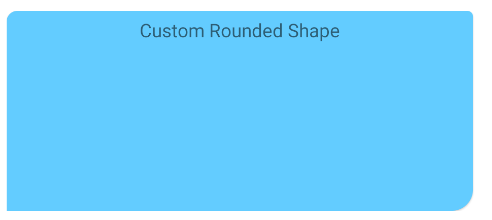
Define a custom style inheriting a material card style (for example Widget.MaterialComponents.CardView) and use the shapeAppearanceOverlay attribute:
  <style name="CustomCardViewStyle" parent="@style/Widget.MaterialComponents.CardView">
     <item name="shapeAppearanceOverlay">@style/ShapeAppearanceOverlay_card_custom_corners</item>
  </style>


  <style name="ShapeAppearanceOverlay_card_custom_corners" parent="">
    <item name="cornerFamily">rounded</item>
    <item name="cornerSizeTopRight">4dp</item>
    <item name="cornerSizeTopLeft">8dp</item>
    <item name="cornerSizeBottomRight">16dp</item>
    <item name="cornerSizeBottomLeft">0dp</item>
  </style>
You can also achieve it programmatically.
Just apply a custom ShapeAppearanceModel to the corners of the card.
Something like:
float radius = getResources().getDimension(R.dimen.my_corner_radius);
cardView.setShapeAppearanceModel(
  cardView.getShapeAppearanceModel()
      .toBuilder()
      .setTopLeftCorner(CornerFamily.ROUNDED,..)
      .setTopRightCorner(CornerFamily.ROUNDED,..)
      .setBottomRightCorner(CornerFamily.ROUNDED,radius)
      .setBottomLeftCornerSize(0)
      .build());
Note: it requires the version 1.1.0 of the library.
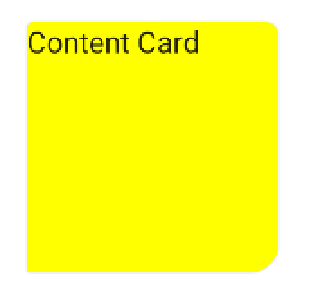
With Jetpack compose you can use the shape parameter in the Card.
Something like:
Card(
    shape = RoundedCornerShape(
        topStart = 4.dp,
        topEnd = 8.dp,
        bottomEnd = 16.dp,
        bottomStart = 2.dp,
    )
){
    Text("Content Card")
}