in your case
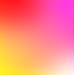
Method 1:
jsFiddle Demo
div{
overflow: hidden;
background: #f06;
background: linear-gradient(45deg, #fff722, #ff26f9);
min-height: 100%;
width: 256px;
height: 256px;
position: relative;
z-index: 1;
box-shadow: inset -20px 0 38px -18px #ff26f9,inset -3px -13px 65px -18px yellow;
}

div:before,div:after{
    content:'';
    position:absolute;
    width:100%;
    height:100%;
}
div:before{
    background: red;
    box-shadow: 0 0 140px 64px red;
    z-index:2;
    top: -96%;
left: -72%;
    opacity: 0.8;
}
div:after {
background: white;
z-index: 3;
bottom: -96%;
right: -72%;
box-shadow: 0 0 140px 64px white;
opacity: 1;
border-radius: 100%;
}
Method 2:
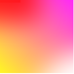
div{
overflow: hidden;
background: #f06;
background: linear-gradient(45deg, #fff722, #ff26f9);
min-height: 100%;
width:256px;
height:256px;
position:relative;
    z-index:1;
}

div:before,div:after{
    content:'';
    position:absolute;
    width:100%;
    height:100%;
}
div:before{
    background: red;
    box-shadow: 0 0 140px 64px red;
    z-index:2;
    top: -96%;
left: -72%;
    opacity: 0.8;
}
div:after {
background: white;
z-index: 3;
bottom: -96%;
right: -72%;
box-shadow: 0 0 140px 64px white;
opacity: 1;
border-radius: 100%;
}
jsFiddle Demo
Method 3: multiple background:

div{
background: #f06;
background: linear-gradient(45deg, #fff722, #ff26f9),linear-gradient(142deg, transparent, white),linear-gradient(108deg, red, transparent);
min-height: 100%;
width:256px;
height:256px;
position:relative;
    z-index:1;
}
jsFiddle Demo
Method 4: pseudo element
div{
background: #f06;
background: linear-gradient(45deg, #fff722, #ff26f9);
min-height: 100%;
width:256px;
height:256px;
position:relative;
    z-index:1;
}

div:before,div:after{
    content:'';
    position:absolute;
    width:100%;
    height:100%;
    opacity: 0.8;
}
div:before{
    background: linear-gradient(108deg, red, transparent);
    z-index:2;
    top:0;
    left:0;
}
div:after{
    background: linear-gradient(142deg, transparent, white);
    z-index:3;
    bottom:0;
    right:0;
}
the markup:
<div></div>
jsFiddle Demo
Method 5:
div{
overflow: hidden;
background: #f06;
background: linear-gradient(45deg, #fff722, #ff26f9);
min-height: 100%;
width:256px;
height:256px;
position:relative;
    z-index:1;
}

div:before,div:after{
    content:'';
    position:absolute;
    width:100%;
    height:100%;
}
div:before{
    background: linear-gradient(108deg, red, transparent);
    z-index:2;
    top:0;
    left:0;
    opacity: 0.8;
}
div:after {
background: white;
z-index: 3;
bottom: -96%;
right: -72%;
box-shadow: 0 0 110px 54px white;
opacity: 1;
border-radius: 100%;
}
jsFiddle Demo
Update: many thanks to Ana-Maria Tudor <3
body{
position:fixed;
top:0;
right:0;
bottom:0;
left:0;
}

body:before {
  content: '';
  position:absolute;
  top:0;
  right:0;
  bottom:0;
  left:0;
  display: block;
  width: 100%;
  height: 600px;
  border-radius: 0%;
  background:
    radial-gradient(circle at 50% 0,
         rgba(255,0,0,.5), rgba(255,0,0,0) 70.71%),
    radial-gradient(circle at 6.7% 75%,
         rgba(0,0,255,.5), rgba(0,0,255,0) 70.71%),
    radial-gradient(circle at 93.3% 75%,
         rgba(0,255,0,.5), rgba(0,255,0,0) 70.71%);
}
jsFiddle Demo