Option 1: Generating Automatically:
You can create a navigation component from templates provided by Material itself using ‘Angular CLI component schematics’
ng generate @angular/material:nav your-component-name
The above command will generate a new component that includes a toolbar with the app name and a responsive side nav based on Material breakpoints.
See more about angular material schematics here
Option 2: Implementing Manually:
To implement that, you just have to refer these two links:
- Resizing Sidenav | Angular Material
- Navigation List | Angular Material
glance through the following code. Implementation will be something like this:
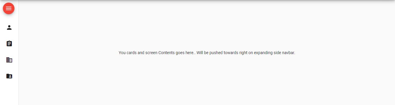
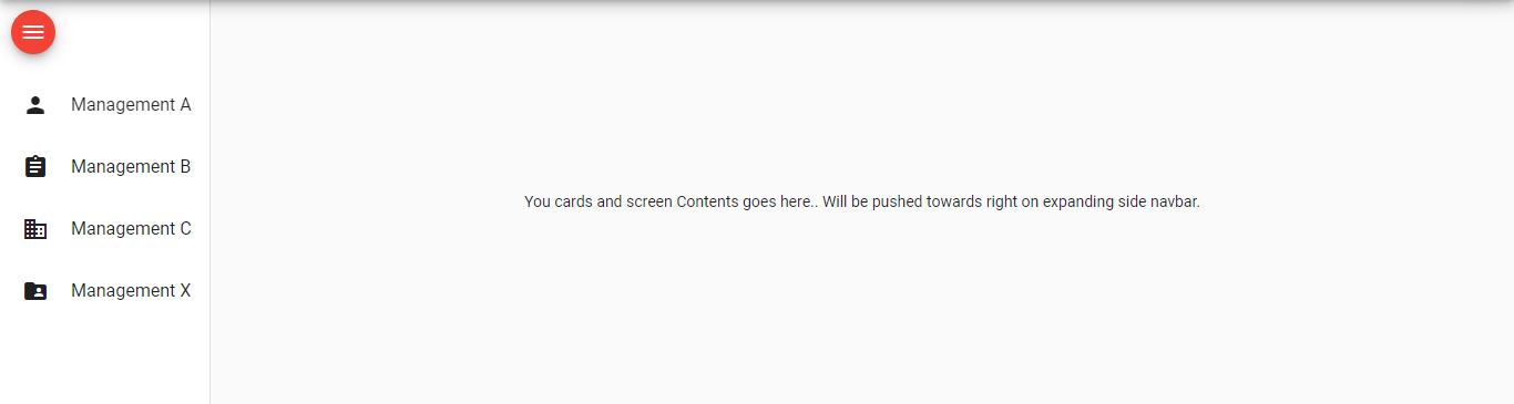
<mat-drawer-container class="example-container mat-typography" autosize>
  <mat-drawer #drawer mode="side" disableClose="true" opened="true">
    <button mat-mini-fab (click)="isExpanded = !isExpanded" color="warn" style="margin: 10px;">
      <mat-icon aria-label="Menu">menu</mat-icon>
    </button>

    <mat-nav-list>
      <mat-list-item>
        <mat-icon mat-list-icon>person</mat-icon>
        <h4 mat-line *ngIf="isExpanded">Management A</h4>
      </mat-list-item>
      <mat-list-item>
        <mat-icon mat-list-icon>assignment</mat-icon>
        <h4 mat-line *ngIf="isExpanded">Management B</h4>
      </mat-list-item>
      <mat-list-item>
        <mat-icon mat-list-icon>domain</mat-icon>
        <h4 mat-line *ngIf="isExpanded">Management C</h4>
      </mat-list-item>
      <mat-list-item>
        <mat-icon mat-list-icon>folder_shared</mat-icon>
        <h4 mat-line *ngIf="isExpanded">Management X</h4>
      </mat-list-item>
    </mat-nav-list>
  </mat-drawer>

  <div class="example-sidenav-content">
    You cards and screen Contents goes here..
    Will be pushed towards right on expanding side navbar.
  </div>
</mat-drawer-container>