Bootstrap 3 introduces responsive tables:
<div class="table-responsive">
  <table class="table">
    ...
  </table>
</div>
Bootstrap 4 is similar, but with more control via some new classes:
…responsive across all viewports … with
.table-responsive. Or, pick a maximum breakpoint with which to have a responsive table up to by using.table-responsive{-sm|-md|-lg|-xl}.
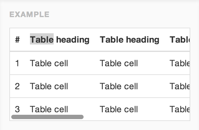
Credit to Jason Bradley for providing an example: