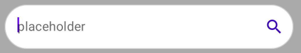
You can define these attributes to apply a Transparent color:
focusedIndicatorColorunfocusedIndicatorColordisabledIndicatorColor
Something like:
   TextField(
       //..
       colors = TextFieldDefaults.textFieldColors(
            textColor = Color.Gray,
            disabledTextColor = Color.Transparent,
            backgroundColor = Color.White,
            focusedIndicatorColor = Color.Transparent,
            unfocusedIndicatorColor = Color.Transparent,
            disabledIndicatorColor = Color.Transparent
        )
    )
Starting with 1.2.0 you can also use the new OutlinedTextFieldDecorationBox together with BasicTextField customizing the border or the indicator line.
    val interactionSource = remember { MutableInteractionSource() }
    val enabled = true
    val singleLine = true
    val colors = TextFieldDefaults.outlinedTextFieldColors()

    BasicTextField(
        value = value,
        onValueChange = onValueChange,
        modifier = modifier,
        // internal implementation of the BasicTextField will dispatch focus events
        interactionSource = interactionSource,
        enabled = enabled,
        singleLine = singleLine
    ) {
        TextFieldDefaults.OutlinedTextFieldDecorationBox(
            value = value,
            visualTransformation = VisualTransformation.None,
            innerTextField = it,
            // same interaction source as the one passed to BasicTextField to read focus state
            // for text field styling
            interactionSource = interactionSource,
            enabled = enabled,
            singleLine = singleLine,
            // update border thickness and shape
            border = {
                TextFieldDefaults.BorderBox(
                    enabled = enabled,
                    isError = false,
                    colors = colors,
                    interactionSource = interactionSource,
                    shape = CircleShape,
                    unfocusedBorderThickness = 1.dp,
                    focusedBorderThickness = 1.dp
                )
            }
        )
    }
Also you can use a TextFieldDecorationBox applying the indicatorLine modifier specifying the focusedIndicatorLineThickness and unfocusedIndicatorLineThickness values:
   val colors = TextFieldDefaults.textFieldColors(
        backgroundColor = White,
        focusedIndicatorColor = Gray)

    BasicTextField(
        modifier = Modifier
            .border(1.dp, Color.LightGray, CircleShape)
            .indicatorLine(
                enabled = enabled,
                isError = false,
                colors = colors,
                interactionSource = interactionSource,
                focusedIndicatorLineThickness = 0.dp,
                unfocusedIndicatorLineThickness = 0.dp
            )
            .background(colors.backgroundColor(enabled).value, CircleShape),
    ) {
        TextFieldDecorationBox(
            //...
            colors = colors
        )
    }